docs
sap.f.GridList
The GridList allows you to use different types of layouts responsible for the positioning and responsiveness of the content.
Overview
A grid is a two-dimensional structure composed of a series of intersecting vertical and horizontal guidelines used to structure content. The grid serves as a framework in which you can organize controls in a consistent way throughout the design. Dividing a design space into a grid can help position individual elements in a visually appealing manner, facilitate the representation of a user flow, and make information more comprehensible and accessible.
With the new sap.f.GridListcontrol, you can easily organize and align your content according to your preferences.
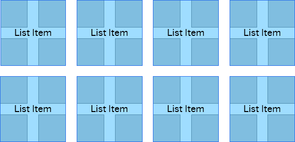
An example of a uniform grid layout, where all the grid items in a grout take the same dimensions

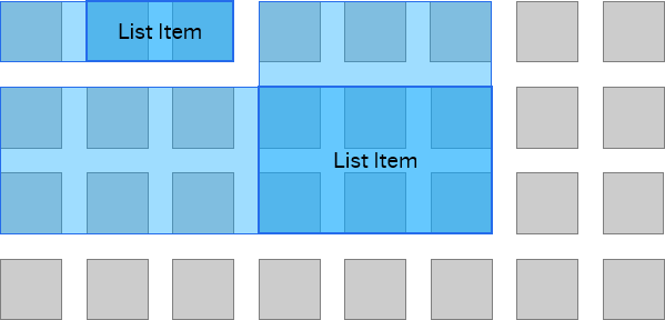
GridList allows for high flexibility layouts, where the app developer can decide on the specific placement and sizing of the grid items

Layouts
sap.f.GridList allows application developers to display list items in a two-dimensional grid where the visual layout/display options can be configured flexibly using predefined and custom templates. The layout used is based on the CSS display grid and has a default configuration that displays the list items in a grid.
sap.ui.layout.GridBoxLayout
sap.ui.layout.GridBoxLayout is a layout that allows you to position controls in a grid, relative to one another, using constraints defined by its boxWidth, boxMinWidh or boxesPerRowConfig properties.
-
boxMinWidthallows the items insidesap.ui.layout.GridBoxLayoutto accommodate the available width without allowing them to be smaller than the specifiedboxMinWidth. -
boxWidthsets the exact width of the items insidesap.ui.layout.GridBoxLayoutregardless of the remaining space available in the row. -
boxesPerRowConfigallows the alignment and specification of the number of items in a row, depending on the browser viewport size.
Note:
The height of all items is set to the height of the highest item.
If the
boxWidthproperty is set,boxMinWidthandboxesPerRowConfigproperties are ignored. If theboxMinWidthproperty is set,boxesPerRowConfigproperty is ignored.
Related Information