docs
Creating Tables
A Table basically consists of columns (sap.m.Column) and rows. The rows, defines as sap.m.ColumnListItems consist of cells.
-
To build a table, we first need to define columns. For this purpose you can define the Column control with the following properties or aggregations:
Property or Aggregation Description **header** Defines column header. Any control can be used but most likely **Label** or **Text** control. If any column has header definition then header line gets visible for all columns. **footer** Any control can be assigned to be displayed in the column footer. If at least one column has a footer definition, then the footer line is displayed for all columns. **width** Defines the width of the column. If you leave it empty then this column covers the remaining space. **hAlign** Defines the horizontal alignment\(*Begin*, *Center*, *End*, *Left*, *Right*\) of the column content. Controls with a textAlign property inherit the horizontal alignment from Column hAlign property. **vAlign** Defines the vertical alignment of column cells. Possible values are *Top*, *Middle*, and *Bottom*. This property does not affect the vertical alignment of header and footer. **visible** Specifies whether the column is visible. Invisible columns are not rendered. -
Sure, we have more properties to make it responsive and to change the design of a column, but we will explain this later. Now, let’s see how we can define a right aligned column header:
<Table> <columns> <Column width="12em"> <Text text="Product" /> </Column> <Column minScreenWidth="Tablet" demandPopin="true"> <Text text="Supplier" /> </Column> </columns> </Table> -
To build a Table, you have to define table rows. For this purpose you use
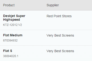
ColumnListItems.ColumnListItemshave a cell aggregation (one to many) which defines cells in one row according to the column definition. Let’s build a real table example to understand it better. Here is the implementation:<Table> <columns> <Column width="12em"> <Text text="Product" /> </Column> <Column minScreenWidth="Tablet" demandPopin="true"> <Text text="Supplier" /> </Column> </columns> <items> <ColumnListItem> <cells> <ObjectIdentifier title="{Name}" text="{ProductId}" class="sapUiTinyMarginTopBottom" /> <Text text="{SupplierName}" /> </cells> </ColumnListItem> </items> </Table>And that is what we have built:
The
mergeFunctionNameproperty holds the function that the column merge functionality uses to pull the property value to compare for duplicates. The default ofgetTextcan be used for the most common use cases, where ansap.m.Labelorsap.m.Textcontrol is used, but if you have another control with a different function to pull the comparison property value from, you can specify it as themergeFunctionName. For example, thesap.m.Iconcontrol has agetSrcgetter function that returns thesrcproperty value - the icon’s URI, which is a good candidate for comparison.
API References