docs
Step 18: Icons (TypeScript)
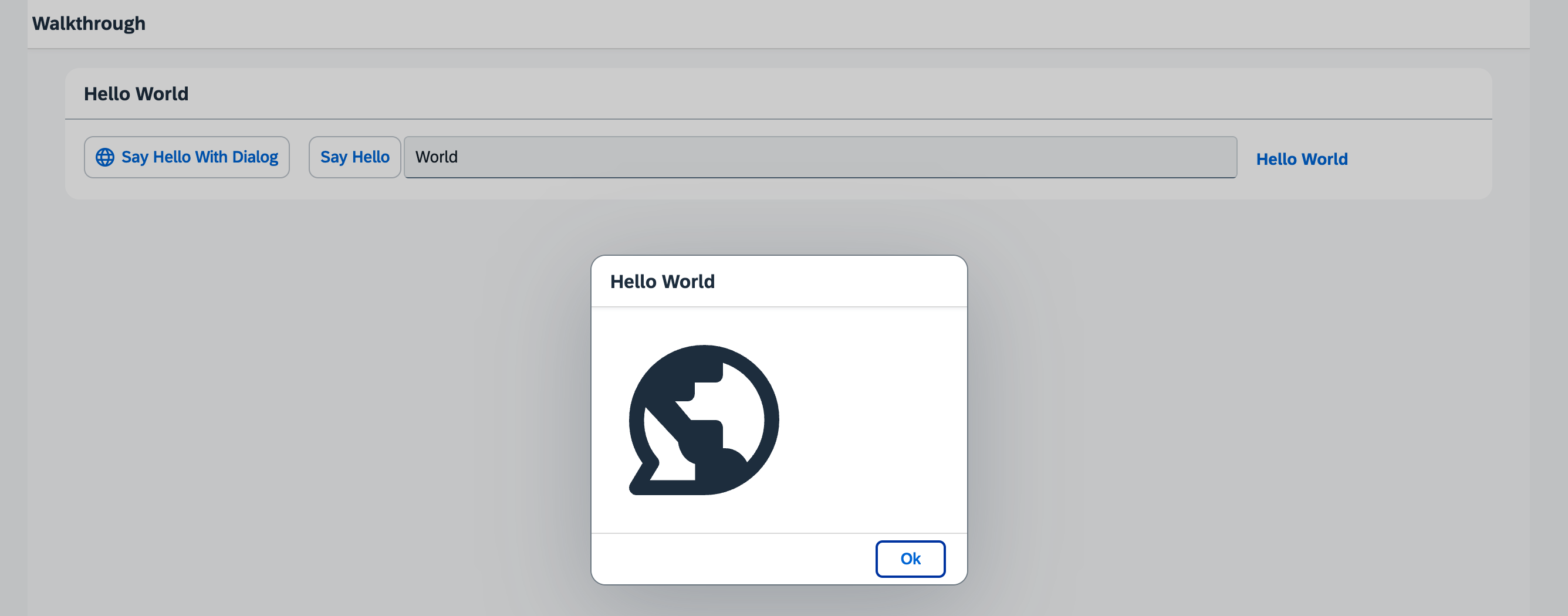
Our dialog is still pretty much empty. Since OpenUI5 is shipped with a large icon font that contains more than 500 icons, we will add an icon to greet our users when the dialog is opened.
Preview
An icon is now displayed in the dialog box

Coding
You can view all files at OpenUI5 TypeScript Walkthrough - Step 18: Icons and download the solution as a zip file.
webapp/view/HelloPanel.view.xml
We add an icon to the button that opens the dialog. The sap-icon:// protocol is indicating that an icon from the icon font should be loaded. The identifier world is the readable name of the icon in the icon font.
<mvc:View
   controllerName="ui5.walkthrough.controller.HelloPanel"
   xmlns="sap.m"
   xmlns:mvc="sap.ui.core.mvc">
   <Panel
      headerText="{i18n>helloPanelTitle}"
      class="sapUiResponsiveMargin"
      width="auto" >
      <content>
         <Button
            id="helloDialogButton"
            icon="sap-icon://world"
            text="{i18n>openDialogButtonText}"
            press=".onOpenDialog"
            class="sapUiSmallMarginEnd"/>
         <Button
            text="{i18n>showHelloButtonText}"
            press=".onShowHello"
            class="myCustomButton"/>
         <Input
            value="{/recipient/name}"
            valueLiveUpdate="true"
            width="60%"/>
         <FormattedText
            htmlText="Hello {/recipient/name}"
            class="sapUiSmallMargin sapThemeHighlight-asColor myCustomText"/>
      </content>
   </Panel>
</mvc:View>
Tip:
You can look up other icons using the Icon Explorer tool.
To call any icon, use its name as listed in the Icon Explorer in
sap-icon://<iconname>.
webapp/view/HelloDialog.fragment.xml
In the dialog fragment, we add an icon control to the content aggregation of the dialog. Luckily, the icon font also comes with a “Hello World” icon that is perfect for us here. We also define the size of the icon and set a medium margin on it.
<core:FragmentDefinition
   xmlns="sap.m"
   xmlns:core="sap.ui.core" >
   <Dialog
      id="helloDialog"
      title ="Hello {/recipient/name}">
      <content>
         <core:Icon
            src="sap-icon://hello-world"
            size="8rem"
            class="sapUiMediumMargin"/>
      </content>
      <beginButton>
         <Button
            text="{i18n>dialogCloseButtonText}"
            press=".onCloseDialog"/>
      </beginButton>
   </Dialog>
</core:FragmentDefinition>
Conventions
- Always use icon fonts rather than images wherever possible, as they are scalable without quality loss (vector graphics) and do not need to be loaded separately.
Parent topic:Walkthrough Tutorial (TypeScript)
Next:Step 17: Fragment Callbacks (TypeScript)
Previous:Step 19: Aggregation Binding (TypeScript)
Related Information